Yet Another Perl 6 Logo
I recently saw Sebastian Riedel's designs for Perl logos, which I like quite a lot, and it reminded me of some of my own ideas in this area.
When the Camelia logo came out I created a few designs for a variation on the butterfly logo based on twin infinities. I don't really have the skill to render them as artistically or as polished as I would wish but the basic idea was something like the following:
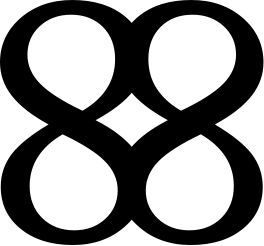
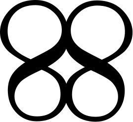
Or with the lower half smaller to emphasise the butterfly shape:
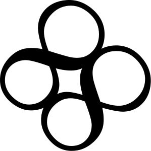
Or with rotation:
If you like this idea and have some artistic flair maybe you could create some more colourful and or polished variations on this theme.
 Just another Perl hacker
So with both Sebastian's and the present logo, they feature the number 6, because of relevance. Maybe I've lost touch with Perl6, but what relevance does the number 8 have to do with it?
+1 with the abstract design.
As with sahqueeks, I also prefer the number 6 than 8. Maybe "the language of the beast" will also add some more publicity to Perl 6 (To the horror of Larry, since I believe he's a Christian of some sort? :)
sahqueeks and Steven: It looks like those are supposed to be infinity symbols, not the 8 character. Then again, an infinity symbol on it's side is just an 8 and vice versa. I think this would lead to confusion, but maybe less so with the rotation in the third example. Personally, I like Camelia :)