Recent work on Chart::GGPlot

loess smooth

A couple of months ago I wrote this blog post Data analysis and visualization in Perl. Then last month I released a 0.0003 version. And today I made a new 0.0005 release to CPAN. Some of the notable improvements in the recent releases are,

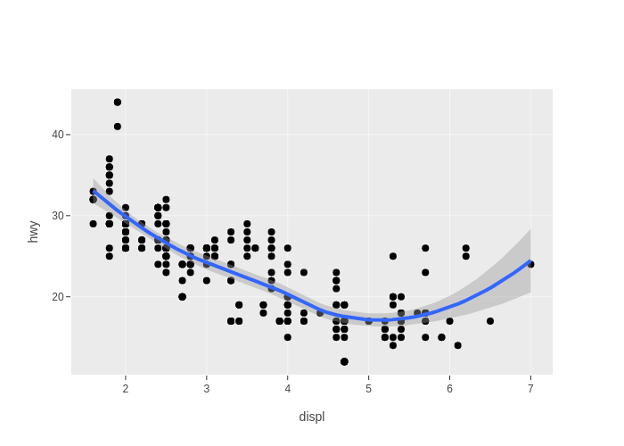
  • Experimental support for scatter plot smoothing (geom_smooth() function). Now it supports LOESS local regression and simple linear regression. To support I created a Math::LOESS package to wrap Cleveland's C/Fortran code. The linear regression is implemented via PDL::Stats::GLM and PDL::GSL::CDF, it's ideally possible to support gernalized linear models but I would put it off to a future time.

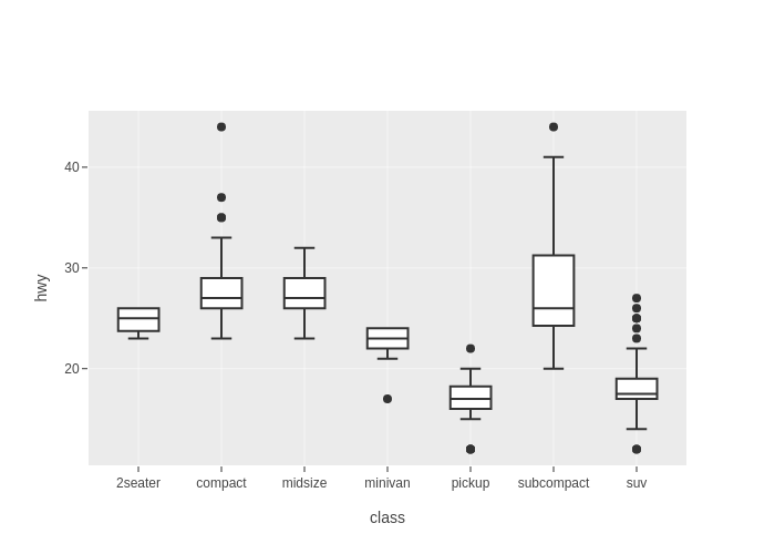
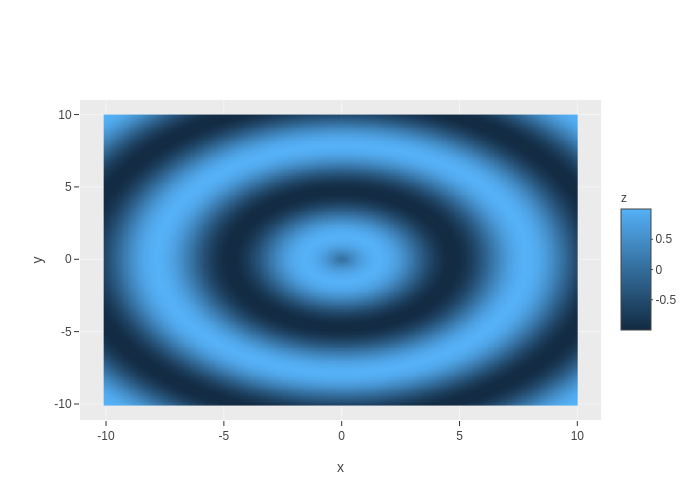
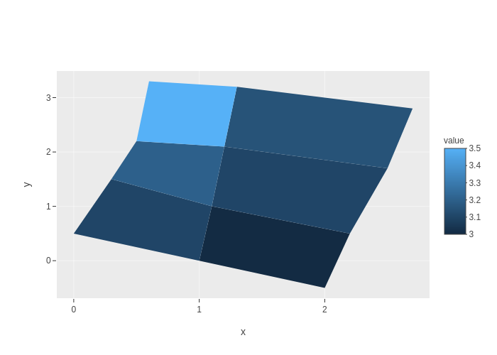
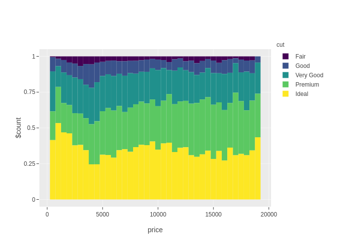
  • New geom types: boxplot, polygon, rect, tile, and raster. “boxplot” is for depicting data's distribution by visualize the quartiles. "raster" in the ggplot system is usually used to create heatmaps, which is commonly for representing data values in a matrix. "polygon" is used implement quite a few things including smooth confidence intervals, the rect and tile geoms, and it's ideally possible to be used to implement geographic spatial plot (, plotly.js seems to have its own plot type for spatial visualizations though). Examples of boxplot, raster, and polygon are shown at end of this post.

  • I created an Alien::Plotly::Orca package to facilitate the installation of plotly orca.

  • Performance of both libraries Chart::GGPlot and Alt::Data::Frame::ButMore have been improved. Your mileage may vary. On my Virtualbox Ubuntu guest for an extreme case of "diamonds" scatter example which has about 54,000 rows of data, it took > 45 sec for the first release of Chart::GGPlot to run and export to png, it now takes < 15 sec (including reading the data frame from csv format, processing the data, and plotting via plotly-orca, plotly-orca runs for like 6~7 seconds).

boxplot raster polygon

Data analysis and visualization in Perl

position<em>stack</em>02_02.png

Hello everybody, this is my first post here, so forgive me if I screw it up.

Let me firstly introduce background of my work. Several years ago I landed onto a Perl job. It also involves some other languages like Python and R, but it was mainly Perl, until last year focus of my role switched and I still do some Perl but much less since then. I was a little bit sad. Perl is indeed a good language, but usually underated outside its community. I am quite good at several programming languages, but with Perl I feel most comfortable and productive. So I thought I might write something at my after-work time, to use my Perl knowledge to create something to give back to the Perl community.

I remembered I read this post Putting Perl Back on Top in the Fields of Scientific and Financial Computing a couple of years ago. I know Perl has PDL since long time ago, but why does it not have a big market share? Well, IMHO there are a few reasons, and one of them is that, it needs a whole ecosystem, by ecosystem I mean several strong libraries that target different aspects of scientific or financial computing, to fullfill user's needs. Python has numpy/scipy and matplotlib since early 2000s. And based on numpy they created pandas which is used a lot today in dataframe-based data analysis. R itself has out-of-the-box dataframe and plotting features, and Hadley Wickham's ggplot2 is so powerful that I heard people not switching from R to Python only because of ggplot2. For Perl IMHO it lacks a great plotting library, and it lack a library that can do dataframe well.

Then I decided to do something in this area: to improve ZMUGHAL's Data::Frame, and to port R's ggplot2 to Perl. It took me several months but it finally has got to a rough usable state. In recent couple of weeks I released two new libraries onto CPAN: Chart::GGPlot and Alt::Data::Frame::ButMore. The latter one was because I've not been able to reach ZMUGHAL.

For those who have not heard of R's ggplot2, it's an implementaion of Leland Wilkinson's The Grammar of Graphics. Basically it allows one to define a plot by specifying various components like geometry layers, scales, etc., on a high level, and map columnar data to the plot. For example, below piece of code would get you that plot on top of this post.

#!/usr/bin/env perl

use strict;
use warnings;

use Chart::GGPlot qw(:all);
use Data::Frame::Examples qw(diamonds);

my $p = ggplot(
    data => diamonds(),
    mapping => aes( x => 'price', fill => 'cut' )
)->geom_histogram( binwidth => 500, position => 'fill' );

$p->show();

More of my Chart::GGPlot examples are here.

So that's it. Thanks for reading. And comments or ideas are welcome :-)