Comparing coronavirus SARS-CoV-2 spike protein sequences with BioPerl
Continuing from extraction of coronavirus spike protein sequences I decided to compare them and see if any mutations could be found. To do this I needed to align sequences to each other and get multiple sequence alignment. There are many tools that might be used and I have chosen MUSCLE as it is fast, easy to use and accurate enough. However, other tools such as MAFFT or T-Coffee should also work well and could give more accurate alignments in more complicated cases than the one I was dealing with.
Let’s gain some MUSCLE
For analysis of multiple sequence alignment (MSA) I chose BioPerl module Bio::Tools::Run::Alignment::Muscle. I found out that in order to install this module I need some dependencies. This worked for me with Perl v5.30 PDL edition on Windows:
cpanm -n XML::DOM::XPath
cpanm Bio::DB::EUtilities Bio::Tools::Run::Alignment::Muscle
Next I installed MUSCLE to folder 'C:\Users\zubenel\Documents\muscle' and changed the name of exe file from muscle3.8.31_i86win32.exe to muscle.exe. This allowed me to enable MUSCLE to find my program with one additional line in code:
BEGIN {$ENV{MUSCLEDIR} = 'C:\Users\zubenel\Documents\muscle'; }
I also added lines for loading all the modules that will be needed:
use v5.12;
use Bio::SeqIO;
use Bio::Tools::Run::Alignment::Muscle;
use Bio::AlignIO;
use Bio::Align::ProteinStatistics;
use Chart::GGPlot qw(:all);
use Alt::Data::Frame::ButMore;
use Data::Frame;
use PDL;
With modules loaded we are ready to align the sequences and see if any differences could be found!
Let’s create MSA and calculate percentage identity between sequences
I created MSA using MUSCLE and BioPerl:
# Creation of MSA factory object - it acts as interface to MUSCLE
my $factory = Bio::Tools::Run::Alignment::Muscle->new();
# Passing a list of sequences to be aligned to the factory:
my $inputfilename = 'corona_spike.fasta';
# Generating MSA:
my $aln = $factory->align($inputfilename);
It came a time to see how similar the spike protein sequences are. To evaluate it I decided to calculate the overall percentage identity. If coronavirus mutates fast the overall percentage identity should not be very close to 100%. Let’s see how identical the viral sequences are:
my $identity = $aln->overall_percentage_identity('long');
printf "\nThe overall percentage identity is: %.2f%%\n", $id;
The overall percentage identity is: 97.33%
The identity of sequences is surprisingly low for a virus that was detected only several months ago. How could it be?
Let’s identify outlier sequences
Next, I decided to look for any sequences that could be outliers. These sequences could differ a lot from all the others and it might be the reason why the overall identity is only ~97%. To see how different each sequence is from each other I created a distance matrix between them and saved it in $spike_dist:
# Creating distance matrix:
my $spike_stats = Bio::Align::ProteinStatistics->new();
my $spike_dist = $spike_stats->distance(-align => $aln,
-method => 'Kimura');
# Getting names of the sequences that will be needed later:
my @seq_names = @{ $spike_dist->names() };
After this I wanted to calculate average distance for each sequence. With a help of Llama book it was easy to write a function that calculates average from a list of numbers:
sub avg {
my(@num_list) = @_;
my $sum;
foreach (@num_list) {
$sum += $_;
}
$sum / @num_list;
}
All this led to the calculation of average distances for each sequence and saving it to an array @average_distances:
my @values;
my %average_distances;foreach (@seq_names) {
# Extracting a row from the distance matrix by sequence name:
@values = $spike_dist->get_row($_);
# Calculating the average distance for a sequence:
$average_distances{$_} = avg(@values);
}
To visualize average distances I decided to create a boxplot. It went like this:
# Creating dataframe that will be used for plotting:
my $df = Data::Frame->new( columns => [
x => zeroes( scalar keys %average_distances ) ,
y => pdl(values %average_distances) ,
] );# Creating boxplot:
my $p = ggplot( data => $df )
->geom_boxplot( mapping => aes( x => 'x' , y => 'y' ) )
->labs(
title => 'Boxplot of average distances ',
y => 'Average distance ',
);
$p->show();
Plot was opened in the browser and looked like this:
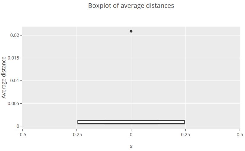
From this an outlier sequence can be identified with average distance > 0.02
Examining outlier sequence
I wanted to see why outlier sequence is more different from all the others. For this I decided to get consensus sequence that could be compared with outlier one:
my $consensus_seq = $aln->consensus_string(90);
Furthermore, I continued the task by selecting outlier sequence:
my $seq_id;
my $length = $aln->length;
foreach my $seq ($aln->each_seq) {
# Extracting sequence name:
$seq_id = $seq->id();
# Selecting only outlier sequence with high average distance:
if ( $average_distances{$seq_id} > 0.02 ) {
# CODE NEXT will be placed here
}
}
After this, I aimed to compare consensus sequence with outlier sequence and print all the cases where differences are found. Keep in mind that spike protein sequences were compared. Thus every letter in alignment means amino acid that is a building block of protein. If these letters change it could mean that protein structure changes. And if the structure of spike protein changes … Well, it means that the ability of coronavirus to bind the cell may change as well. In order to decipher if it could be the case I proceeded like this:
foreach my $position( 1 .. $length ) {# Getting amino acid (aa) from a particular position in consensus sequence$consensus_aa = substr($consensus_seq, $position-1, 1);# Getting amino acid (aa) from a particular position in outlier sequence$seq_aa = $seq->subseq($position, $position);# Print amino acids of positions that differ from consensus and outlier spike protein sequencesif ( $consensus_aa ne $seq_aa ) {print "Sequence $seq_id at position $position has \"$seq_aa\" instead of consensus \"$consensus_aa\"\n";} }
The printed result was:
Sequence QHU79173 at position 22 has "X" instead of consensus "T"
Sequence QHU79173 at position 23 has "X" instead of consensus "Q"
Sequence QHU79173 at position 24 has "X" instead of consensus "L"
Sequence QHU79173 at position 25 has "X" instead of consensus "P"
…
Sequence QHU79173 at position 48 has "X" instead of consensus "L"
Sequence QHU79173 at position 49 has "X" instead of consensus "H"It was seen that in all the cases the amino acid that differed from the consensus was "X". But actually there is no such amino acid! What does it mean? Actually letter "X" has a meaning and it is an amino acid that is unknown. So the differences between the outlier sequence and all the other sequences are not mutations and they are caused only by the lack of information. Apparently, there was no spike protein sequence in the database that has accumulated lots of mutations in its sequence as compared to other coronavirus sequences.
 I blog about Perl.
Nice post!